Web Design / Street Food App
Street Food App is a location-based app to help you find street food.
Role
Web Designer
Program
Figma
Time
May-July 2021
(3 months)
Situation
This is the 1st project from my Google UX Coursera Professional Certificate completed in 2022.
Challenge
Create a dedicated mobile app within the street food space.
Solution
Street Food Finder is a mobile app that allows users to find street food and connect with a community of others.
Empathy through Research
I conducted user interviews to learn more about how different types of people view street food.
User Interviews
I conducted interviews with 6 people who have purchased street food in the past year. I asked them about their street food preferences while they are local and when traveling.
I was able to learn about preferences and frustrations, and created two types of personas who might use the app from the interviews.
Meet the Users
The Traveling Foodie

Kay is a 27 year old Sales Analyst from NJ, currently living with her best friend in New York City. She is a frequent traveler who enjoys trying street food in new cities. She has a travel vlog and has a budget for eating out when traveling.
She uses popular travel and food apps to help with planning, but wants a dedicated street food app to help her organize food tours in city and also to connect with others.
The No-Cooker

Dan is a 31 year old app developer living in Queens, NY. He is not much of a traveler and is focused on finding new food to eat that is quick and cheap. Dan makes an above average salary, but is penny pinching right now to save up for a start up idea .
He has a few street food places he frequents, but wants to learn about new street food establishments that open up in his area. He also wants to be able to save and organize street food spots for convenient reordering and budgeting.
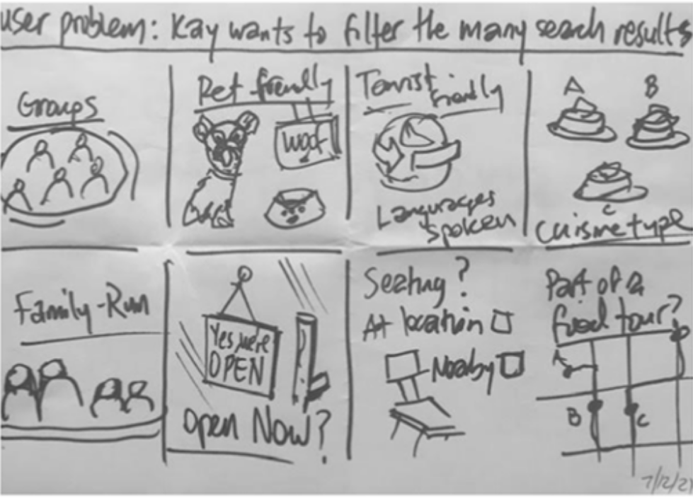
Initial Ideation
Crazy 8′s
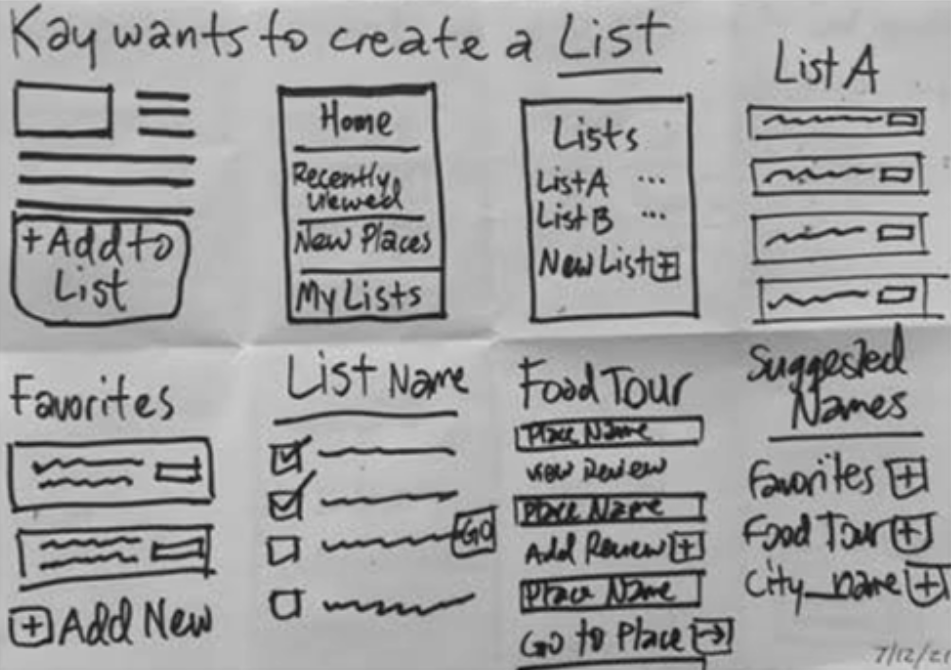
After creating user personas, I performed ideation exercises to generate design solutions based on specific user goals using the app.
Below I focused on the main tasks of researching and organizing street food restaurants:
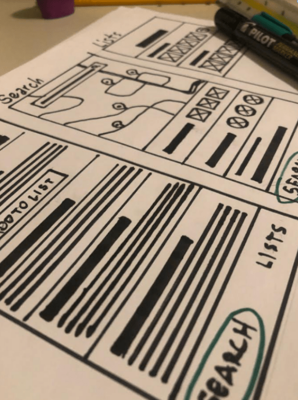
Lo-Fi Wireframe Sketching
After creating user personas, I performed ideation exercises to generate design solutions based on their goals.
I focused on the main tasks of researching and organizing food options:

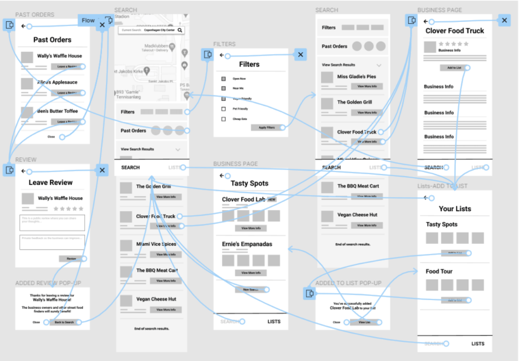
Digital Wire-flows
I understood the main user needs to be 1) Filtering search results and adding a business to a list and 2) Leaving a review for a business, so I prototyped these two user flows below.
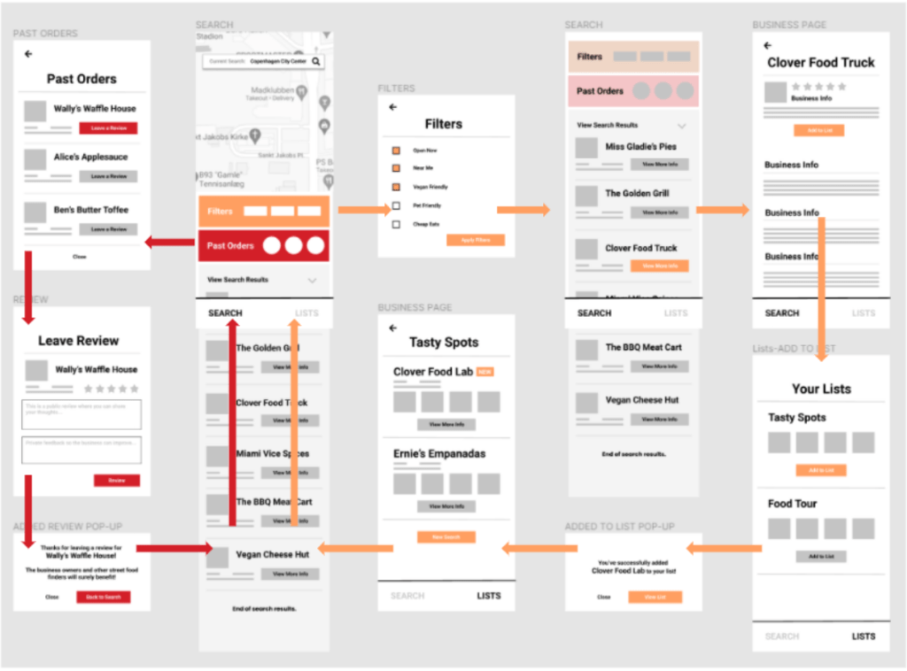
The red flow is to leave a review for a business.
Digital Wireframes
Next, I created low-fidelity wireframes so people can test the app and give feedback on the app’s navigation and components without being distracted by design and colors. I asked 5 people to test the app.
1st Usability Study
After building the low-fidelity prototype, I asked 5 people to test different areas of the app and give feedback on how usable it was.
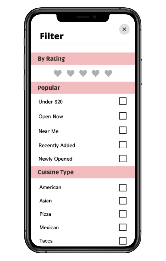
Filtering and sorting is desired
5/5 participants mentioned the addition of more filtering options as valuable
User connection is wanted
4/5 participants mentioned a desire to connect with others and see their favorite street food options
More features in a business page
4/5 participants requested more features within a business page so users can learn more and do more actions
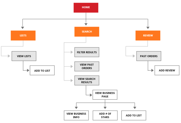
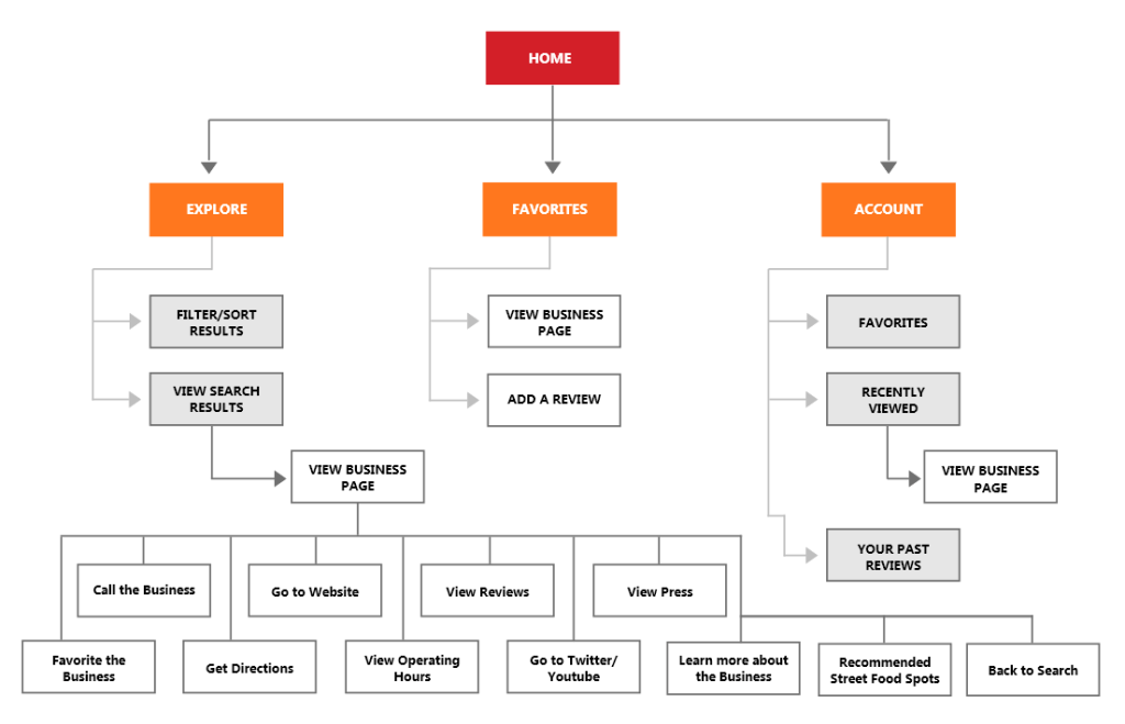
Revised Information Architecture
After receiving feedback from the usability study, I revised the information architecture. Main changes include:
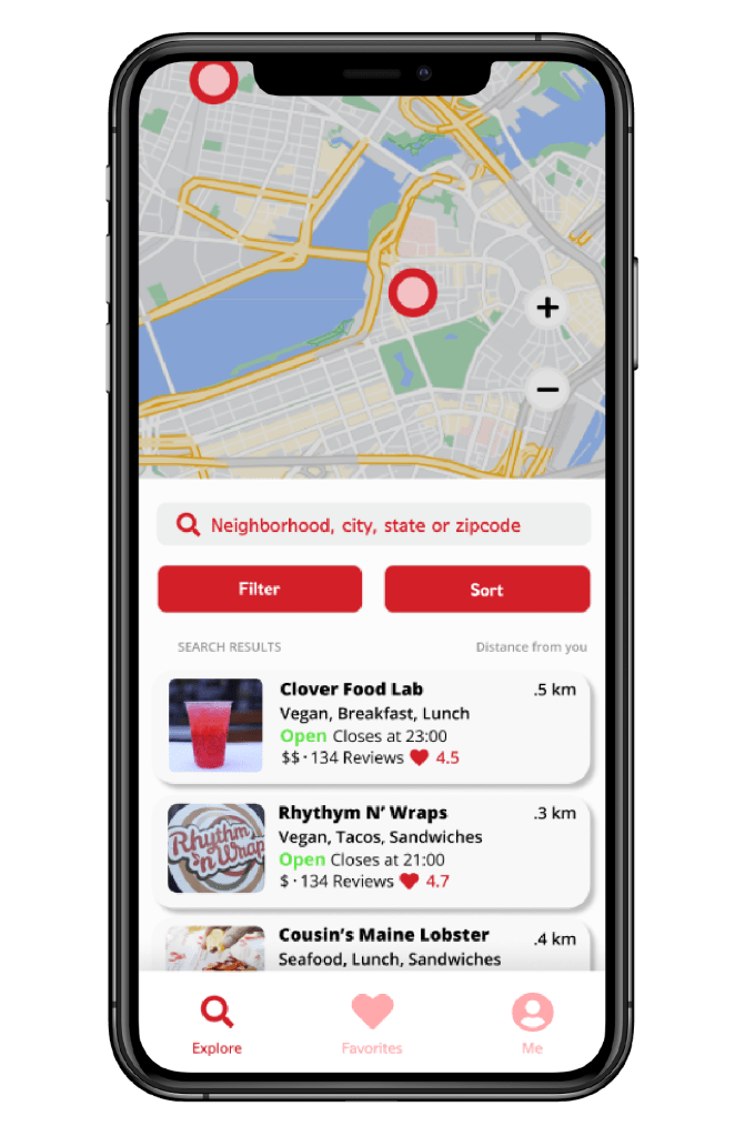
- Changing the navigation buttons from “Lists, Search and Review” to “Explore”, “Favorites” and “Account”
- Adding more informational components to a Business Page
- Changed “Lists” to “Favorites”
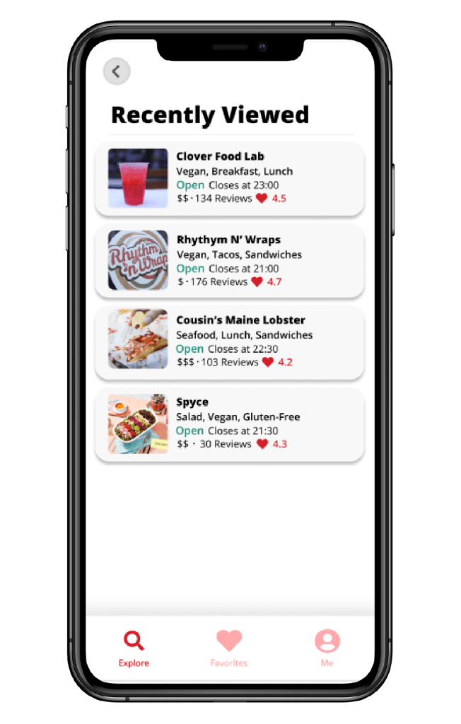
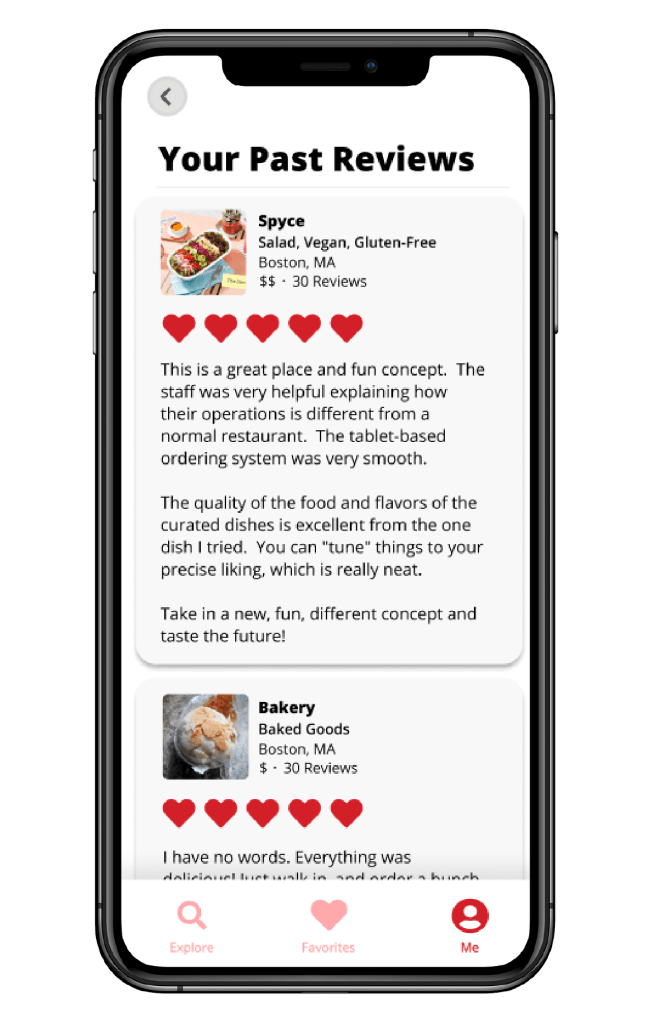
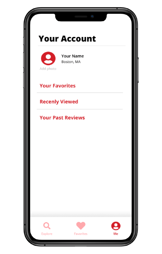
- Added “Favorites”, “Recently Viewed” and “Past Reviews” to Account
Before Usability Study 1
After Usability Study 1
Design Mockups
After the usability study and information architecture improvement, I created hi-fidelity mockups of the app’s screens.


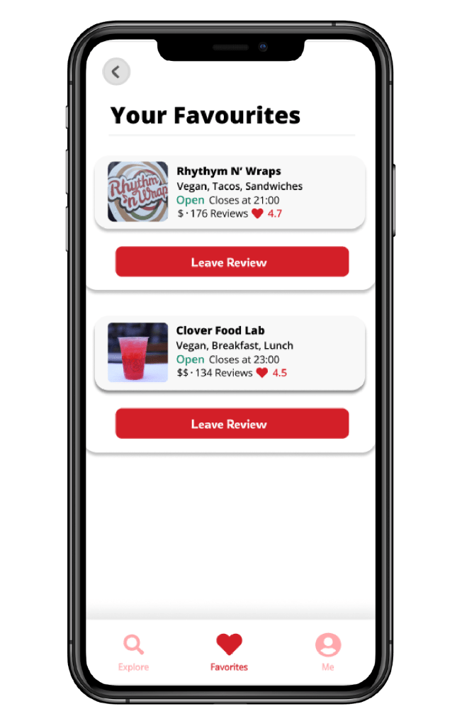
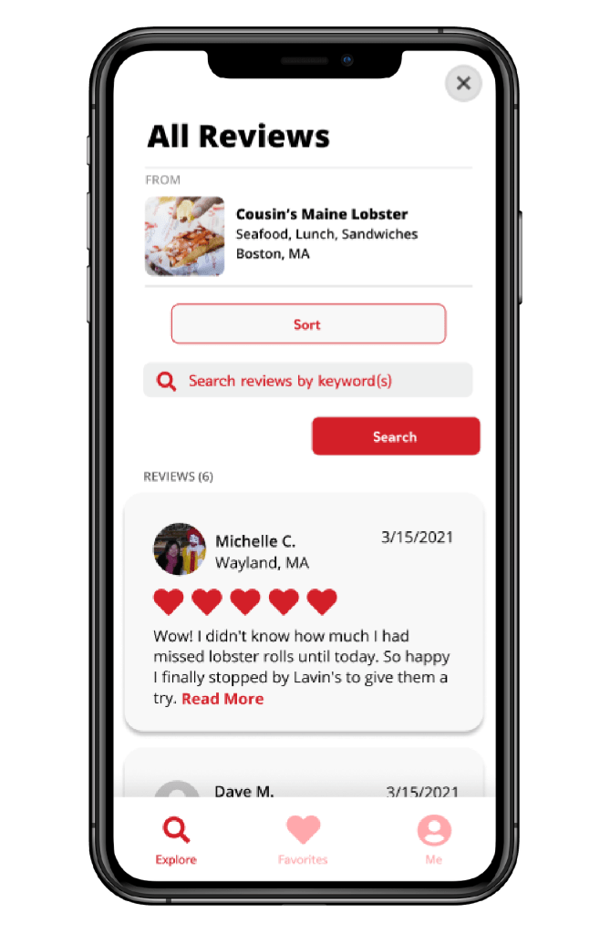
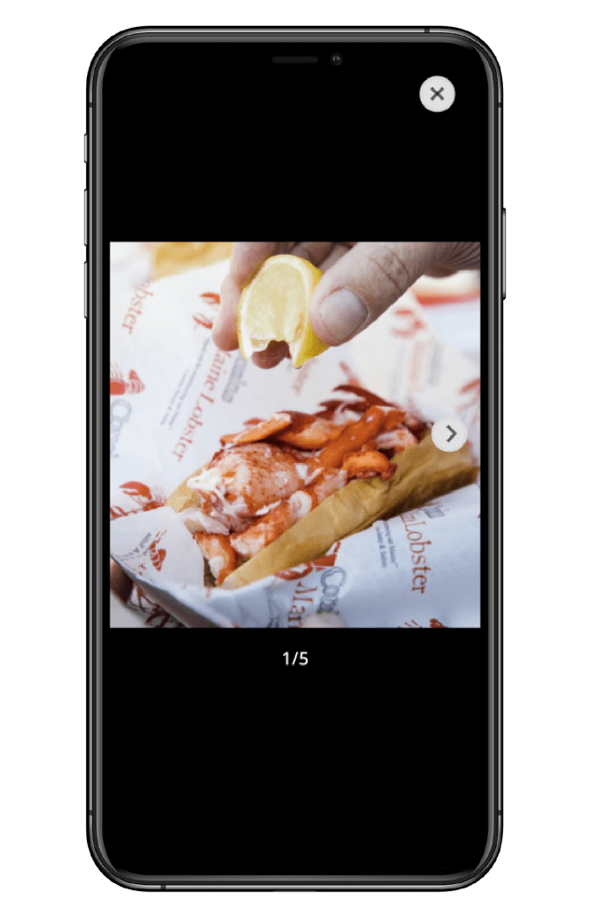
Hi-Fidelity Prototype
After designing hi-fidelity mock-ups, I connected the navigation and screens to build a functional prototype in Figma. You can view it here.
6 people tested the prototype. I asked them to complete the 3 actions of filtering, viewing favorites and viewing a business profile.
What I learned from the 2nd Usability Study
Well presented information allows users to search smarter
What was said:
“I want to see more business information.”
“I’d like to see a profile of the business owner, with a link to their social media.”
“I want to see what other people think are good items to order, and ideally if the app suggested items and street food establishments to me”
People want to connect with others on the app
What was said:
“I wish I could like and/or comment on another person’s review, building more of a community”
“It would be sweet if the app could suggest users for me to follow based on my interests. I could follow along with others’ food journeys and they can follow along with mine”
Ordering and organizing should go hand in hand
What was said:
“It would be cool if there was a way for the app to give me a free order when I reach a certain threshold”
“I wish I could make a list of my favorite food items. It would also be cool if lists recommended businesses based on favorites I’ve selected.”
Next Steps
- Conduct additional usability tests on other areas of the app
- Organize insights from usability tests into a matrix to identify high value and low effort areas to improve first in the app
- Make design improvements based on insights and conduct more testing
What I learned
Have a better understanding of app best practices
When I received feedback from the first usability study, I was disappointed that participants mentioned features I should have already added when I built the low-fidelity prototype.
User interviews should uncover more pain points
As this was my first time going through the UX design process, I wasn’t experienced enough to get to the bottom of why people felt how they felt about certain areas of the app.
Base usability studies on real-world scenarios
I learned it’s not enough to ask users to go through the app and give feedback. I should ask them to complete real tasks as if they were using the app in real life.
Thanks for viewing my case study!
View another case study for a redesign of the YouTube Translation here.
