E-Commerce Clothing Concept
Web Design / Curle Clothing
Role
Web Designer
Program
Adobe XD
Time
July-Nov 2021
(5 months)
Brief
Curle Clothing Company is a new clothing brand concept that needs a website to sell their clothing. They are a brand that releases clothing in limited quantities, so they don’t need the traditional clothing website features like clothing categories and a mega-navigation with many links.
This is the second project from my Google UX Coursera Course completed in 2022.
The Task
Create a responsive website for the clothing company.
The Solution
I created a prototype design in Adobe XD that allows users to view a product, add it to their bag and checkout the shopping bag.
Landscape analysis
I conducted an analysis of different clothing websites to gain a better understanding of the clothing e-commerce space. I learned about industry best practices by examining budget, mid-tier and high-end fashion brands. I also studied a few smaller clothing brands that offer a limited product selection.
Empathy through user research
I conducted interviews with 6 individuals who have purchased clothing online in the past year. I asked them about their online clothing shopping preferences, brands they buy online, and frustrations they’ve faced shopping online.
I was able to uncover insights and created two personas to build the prototype from.
Meet the Users
The Fashionista
Tessa is a 25 year old Office Manager living in San Francisco, CA. She enjoys shopping for new clothing, spending time with friends and family, and working out.
She’s modeled for friends’ clothing brands before, and enjoys posting photos to social media of her wearing new brands. She shops online for most of her purchases and buys both affordable and luxury clothing.
The Supporter

Aaron is a 35 year old tech manager living in Austin, TX. He doesn’t really care about buying name brands, but does enjoy supporting new up-and-coming brands. He admits that he’s not the most fashionable person, but he does cares about looking presentable at work.
He buys half of his clothing online and half in-person, and also shops for clothing for his son and daughter the same way.
Lo-Fi Wireframes in Adobe XD
Below are lo-fidelity wireframe iterations for the Home page, for both Mobile, Tablet and Desktop view.
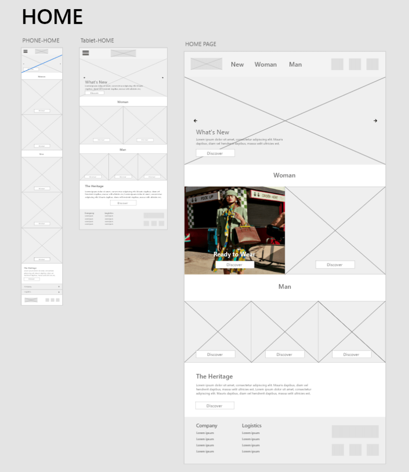
Replicating Existing E-Commerce Architecture
I replicated elements of traditional clothing websites that separate their clothing into Mens, Womens, Kids, Tops/Bottoms etc. Even though this case study focuses on a single product website, there are many similarities to learn from.
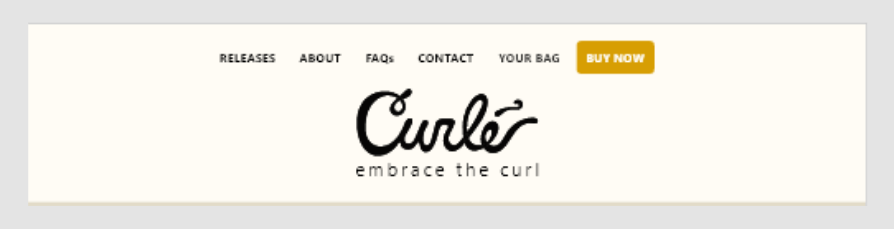
Header and Footer – 1st Iteration
I started with creating the header and footer before moving on to other sections of the website.

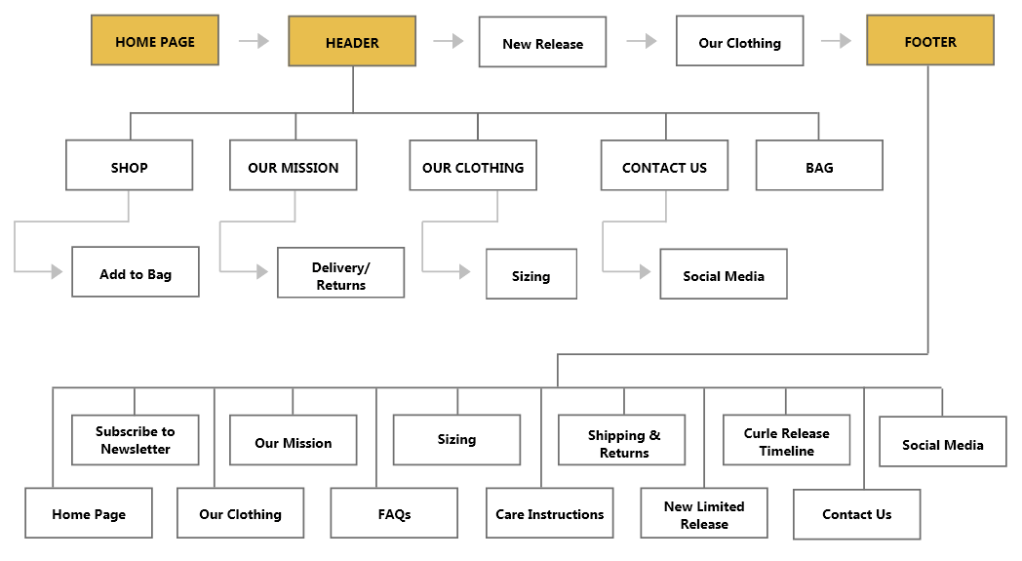
Information Architecture – 1st Iteration
The Information Architecture is a reflection of the Header (and Footer), so the header, footer and information architecture were completed together.

1st Usability Study
I conducted 4 in-person usability studies with people who’ve shopped online in the past year. I asked them to go through the prototype as if they were sent the website link from a friend.
Insights generated include:
“The footer and header look too similar.”
3/4 study participants mentioned they thought the footer could be improved to create a more continuous experience.
“I wish I was able to select a size.”
2/4 participants said they thought the checkout flow had excessive pages and too many input fields.
“What’s Curle all about?”
2/4 participants said they thought the brand messaging could come across more.
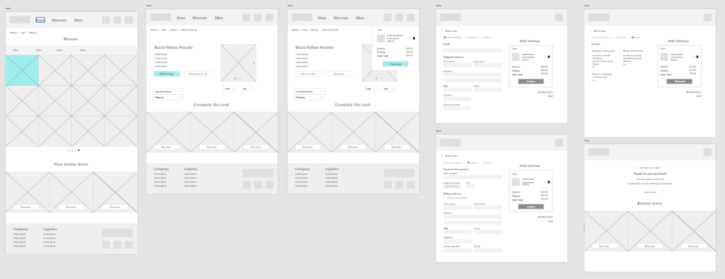
Improvements made from the 1st Usability Study
The usability study participants provided key insights that guided the redesign. Improvements include:
- Improved Header and Footer,
- Redesigned Limited Release Timeline screen
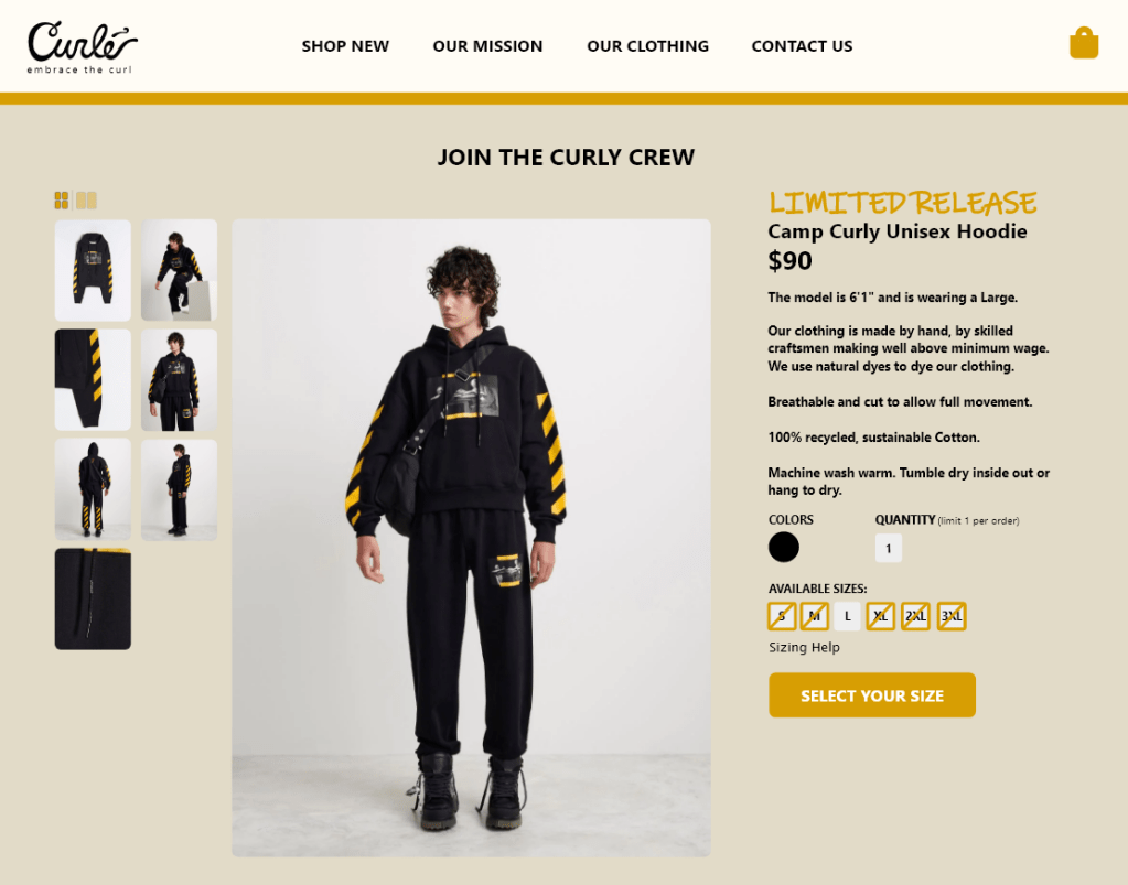
- More detailed product page with size selection
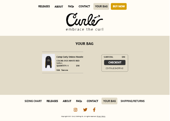
- Redesigned Bag screen with empty bag state
- Simplified checkout flow
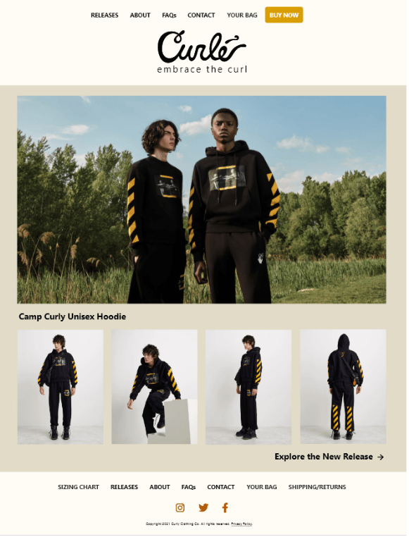
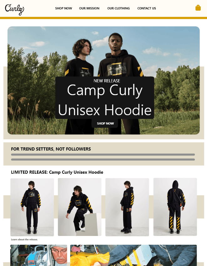
Home Screen
Before and after Usability Study:
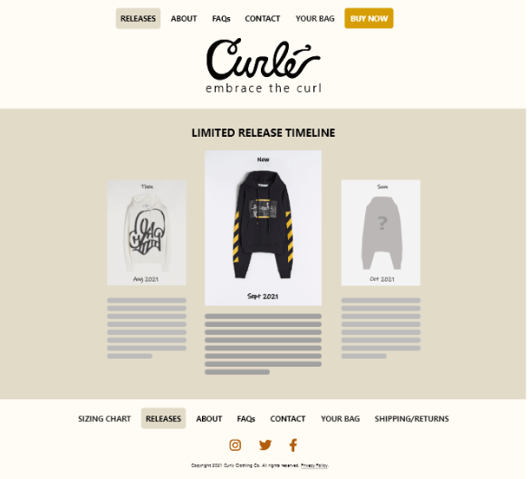
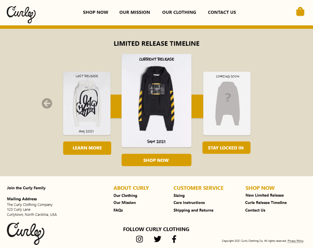
Release Timeline
Before and after Usability Study:
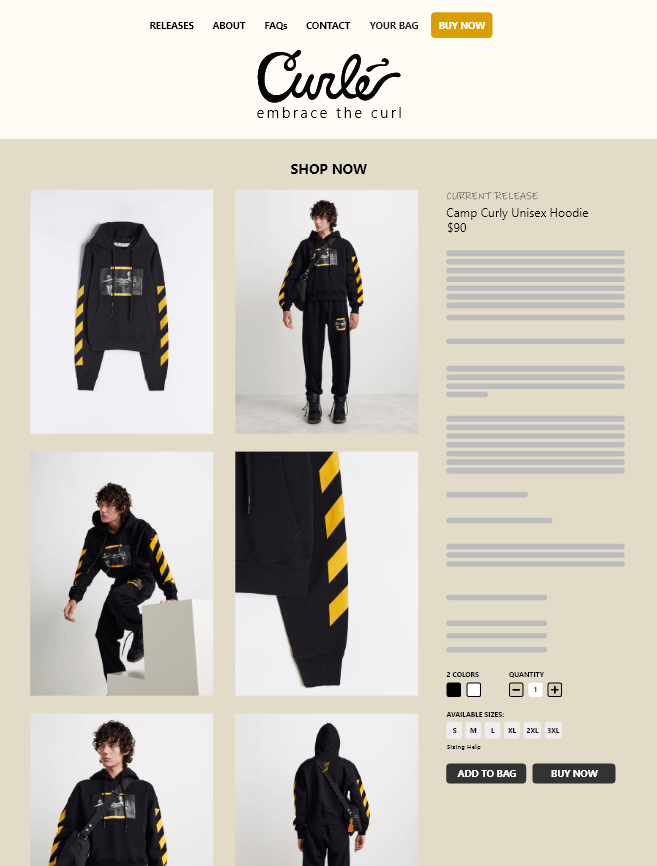
Product Page
Before and after Usability Study:
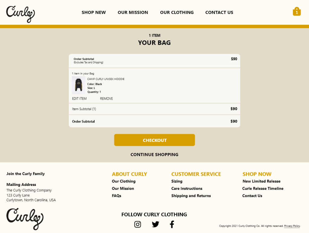
Your Bag Page
Before and after Usability Study:
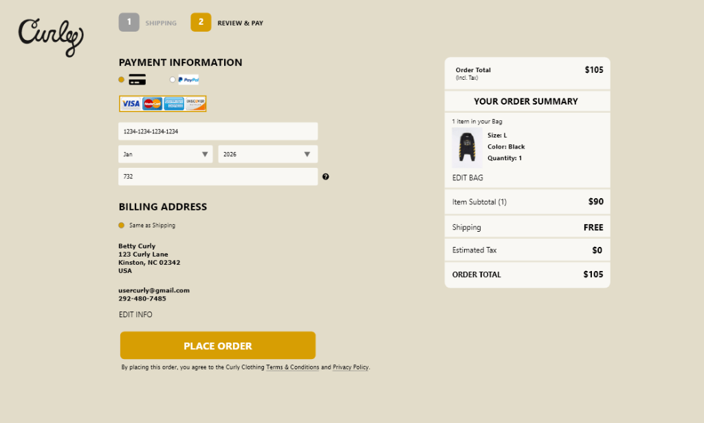
Checkout
Before and after Usability Study:

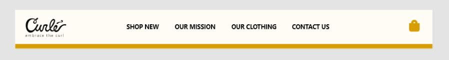
Header
Before and after Usability Study:

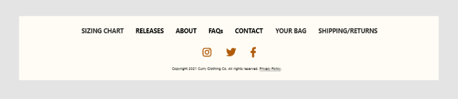
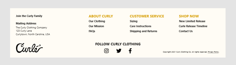
Footer
Before and after Usability Study:
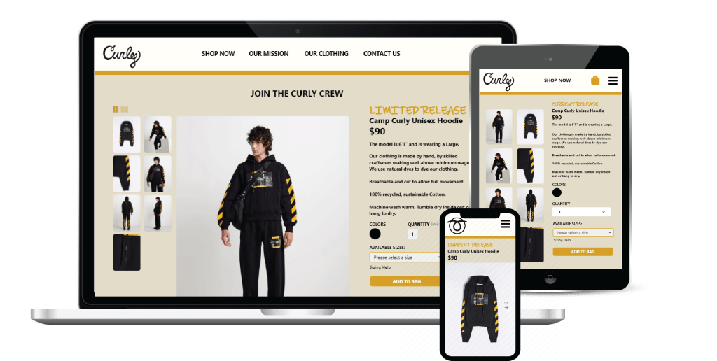
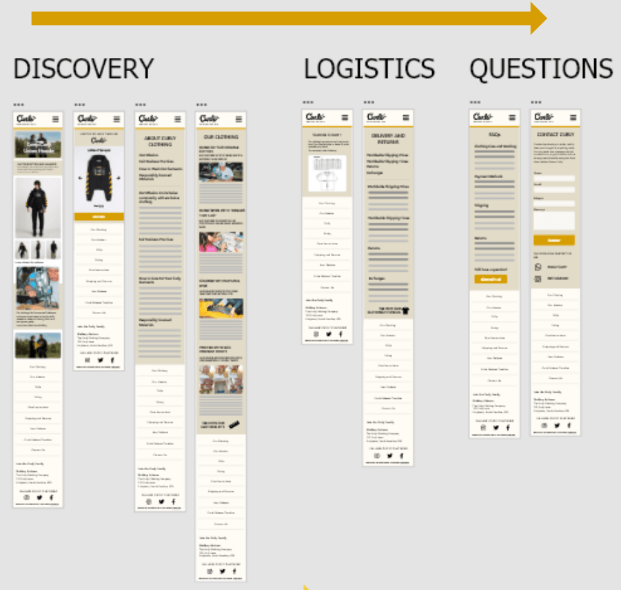
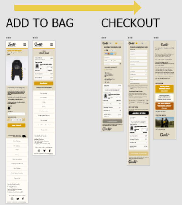
Mobile Mockups in Adobe XD
In addition to the desktop design, I designed mockups for mobile and tablet view.
Below are 2 user flows for discovery, confidence building and purchasing:
Learning more
Adding an item to the bag and checking out
Improved Information Architecture
Before Usability Study
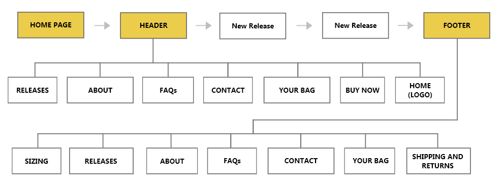
After Usability Study
Hi-Fidelity Prototype
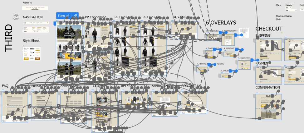
Works best on a laptop
Feedback from 2nd Usability Study
- The more expensive the clothing, the more important the size and fit
- Returns and exchanges are potential problem areas for clothing brands
- People are more inclined to buy a brand if they agree with what it stands for
Next Steps
- Conduct more usability studies and make improvements.
- Advise Curle Clothing Co. on how to market digitally
- Work with Curle to refine the website if they decide they want to sell multiple products at a time.
What I Learned
Usability studies should try to cover all areas of the website
After the first two usability studies, I realized I didn’t get feedback on all areas of the website. The usability studies were around 1 hour each, and I should’ve asked each participant if they would be available for follow-up questions and an additional testing session.
Sketches and notes should go in a dedicated notebook
As a designer, I have a few different notebooks; one for sketching, one for journaling and one for on-the-go. Ideas come to me at different times, but since UX design can get complex, I found it’s important to put sketches and notes for a particular project in one notebook so it’s easy to reference past ideas.
Dive deeper into the competitive analysis
I should have performed a more thorough competitive analysis prior to building and testing the initial prototype. The competitive analysis I conducted didn’t focus enough on the small details e-commerce clothing apps have (like buttons, labels and CTAs). Because of this, the prototype lacked some standard features that users mentioned they wanted to see in the design during the testing sessions.
Thanks for viewing my UX case study!
View another case study for a Twitter engagement platform here.
