Website Redesign
Web Design / Aiden’s Light
Role
Web Designer
Program
Figma
Time
Nov 2021-Jan 2022
Brief
Aiden’s Light is a 501(c)3 nonprofit founded in 2018 in New Jersey to honor the life of a deeply loved child.
The founder of Aiden’s Light created the initial website using Weebly, and the redesign was also done in Weebly.
This is the third and final project from my Google UX Coursera Course completed in 2022.
The Task
The founders of Aiden’s Light’s asked me to redesign their website so potential donors can be more motivated to support the mission of Aiden’s Light.
Additional areas of focus included allowing students to learn more about Aiden’s Light and making applying to the scholarship easier.
The Solution
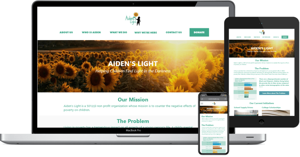
I created a redesigned website that makes it easier for potential supporters to learn about what Aiden’s Light does and to donate.
The redesign also includes the college scholarship application, which I helped improve with a user experience review and suggestions.
The website is currently live at aidenslight.org.
Best viewed on laptop
Empathy through Research
I conducted 6 interviews and performed competitive analysis to gain a better understanding of the types of people who go to Aiden’s Light’s website and what they want to see added to the website.
While conducting the user interviews, I wanted to understand the characteristics and needs of a) high school students who can benefit from Aiden’s Light’s scholarship and b) financial supporters who might want to donate to Aiden’s Light.
User Personas
Scholarship Applicant

Chelsea is a 17 year old high school senior from New Jersey. She enjoys science and art in school. She heard about Aiden’s light from her older sister who received the scholarship.
She liked the Aiden’s Light website, and went through the application to see if she has what’s required.
She gets the recommendations she needs, writes short essays to the application questions, and submits her application.
Retired Activist
Gladie is a 70 year old retired teacher who lives in Maryland with her husband of 40 years. She is a strong supporter of social causes, having participated in many protests in her college and 20’s.
She isn’t able to participate actively anymore, so she’s looking for a young nonprofit or two to give ongoing financial support.
She gets an email about Aiden’s Light from a friend, and goes through the website. She doesn’t learn so much about the organization from the website.
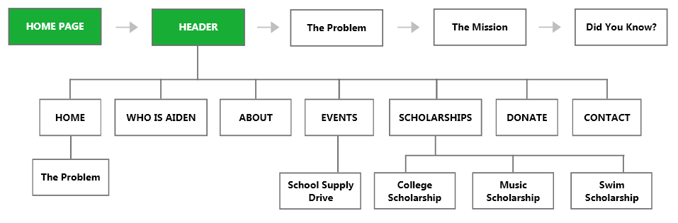
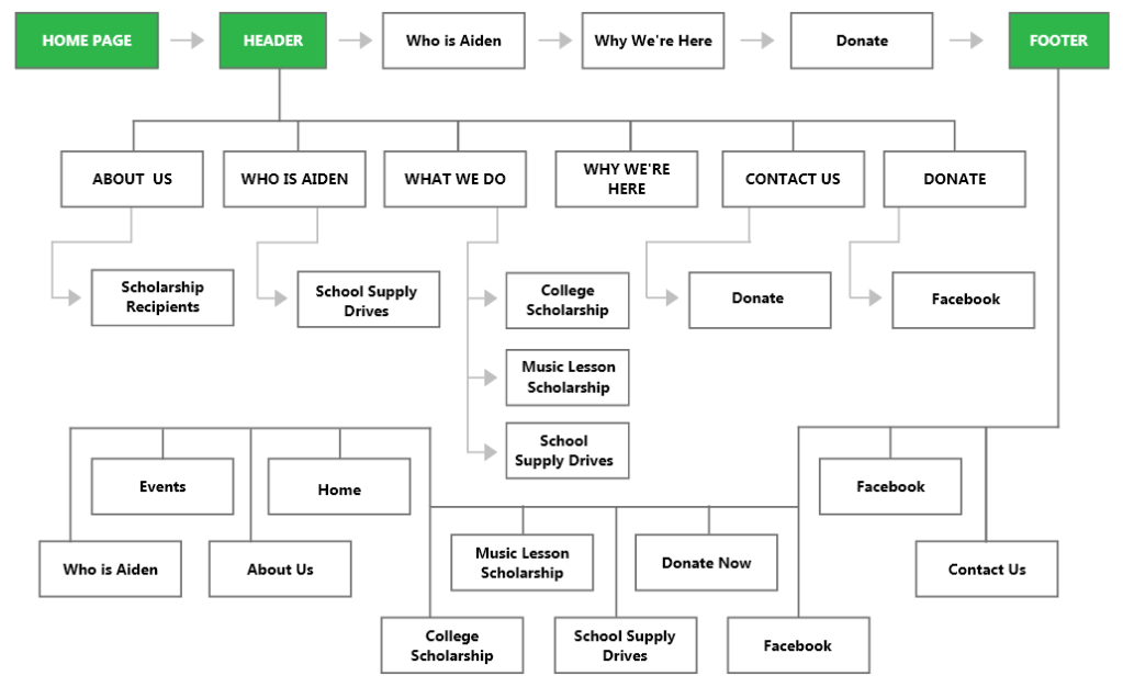
Initial Information Architecture
I created the initial information architecture to better understand the current website.
Sketching Ideation
Home Page
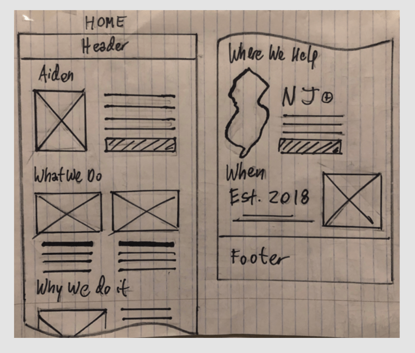
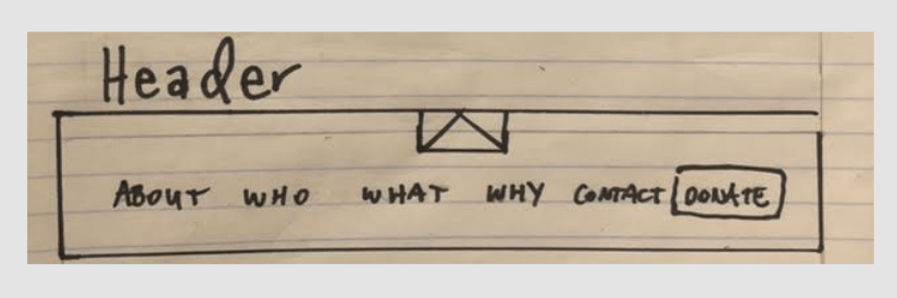
Header
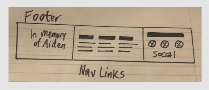
Footer
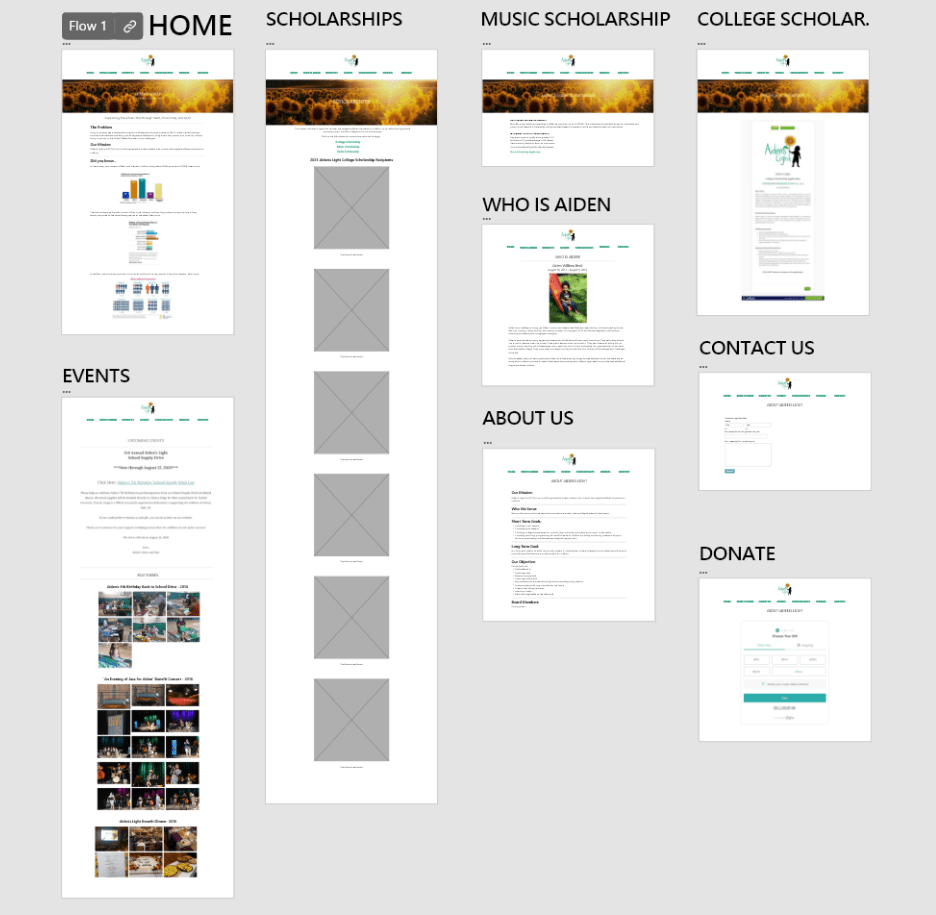
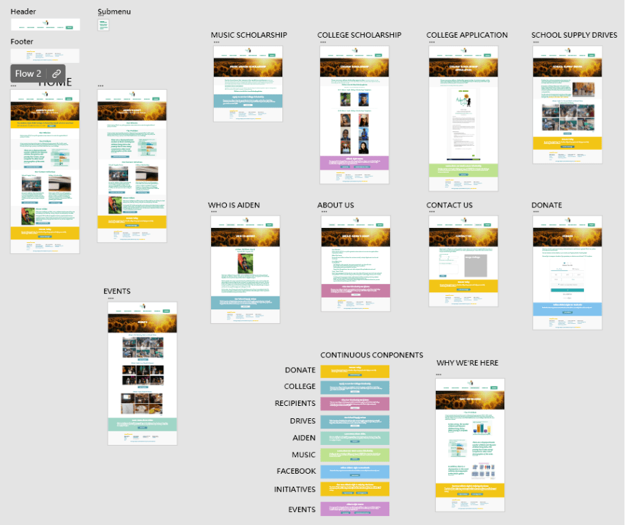
Lo-fidelity Prototype
I recreated the original design in Adobe XD so I could get feedback from users, and to also have a high level view of the website.
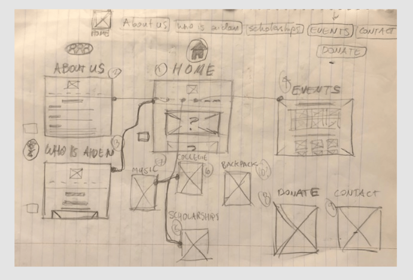
Site Wire-flow
Below I sketched a rough wire flow to get a better feel for how users would move through the site.
Insights from Usability Study
I tested the low-fidelity prototype with 5 participants, and was able to learn pain points and improvement ideas that I used to revise the site.
Reorganized information architecture
5/5 study participants mentioned having difficulty understanding what Aiden’s Light does.
More continuous user flows
4/5 participants were observed having to scroll back up to the header when reaching the end of pages on the website.
More compelling first impression
3/5 participants wanted to see a more compelling Home page and a strengthening of the nonprofit’s overall message.
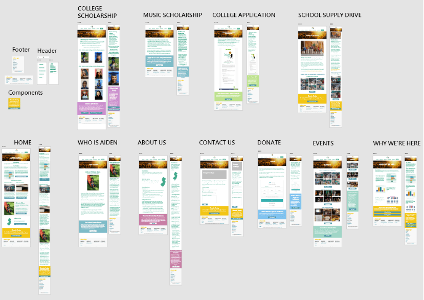
Redesign Information Architecture
After receiving feedback from the usability study, I used the insights to rework the app’s information architecture.
Original Information Architecture

Redesigned Information Architecture
Redesign after Usability Study Feedback
Best viewed on laptop
Mobile and Tablet Design
Effect After the Redesign
After redesigning the website and improving the SEO, aidenslight.org got picked up by a scholarship aggregation site, leading to a 14x average increase in applications in the 2 years after the website redesign.
Because of the increase in applications, I also helped improve the organization of the applicant data as well as the voting process for scholarship winners.
What I Learned
The client relationship is an empathetic process
Through working on this project, I learned that client relationships are more important than the work completed.
Not all clients have the same goals or speed they want to move, and it takes asking the right questions in order to properly empathize with each client.
It’s crucial for UX designers to understand client goals before anything.
Creating a high level view of the website is important
Because this project was a redesign of an existing website, I thought I could use the website as the first and only prototype.
But after recreating the website in Adobe XD, it allowed me to organize all the web pages and see the site from a high level.
This really helped with decision-making for the redesign.
Website redesigns are an ongoing process
Getting from the initial website to the current version of Aiden’s Light was done in many iterative sessions.
Because the initiatives of Aiden’s Light are calendar-based, it was also important to prioritize redesigning pages that website visitors would need for the timely events.
Next Steps
1. Continuously update the website with feedback-based improvements
2. Design pages for the board and new initiatives, and incorporate them into the website when the founders are ready
3. Meet with the board again to see if there are any other goals they wish to complete with the website.
Thanks for viewing my web design case study!
View my first web design case study for a street food finder app here.
