I designed a bilingual sign for 7-Eleven.
June 2023

7-Eleven in Tel Aviv, Israel
I saw online recently that 7-Eleven was coming to Israel. Being from the USA, I’m all too familiar with 7-Eleven having gone there for late night snacks and drinks in middle and high school.
I did some research about how 7-Eleven got its name in case you were curious. 7-Eleven was founded almost 100 years ago in 1927 as a small grocery store attached to an ice house (a place where people bought ice) in Dallas, TX.
The first stores were named “Tote’m Stores” because customers “toted” away their purchases. Some stores featured “native” totem poles in front of the store.
In 1946, the chain’s name was changed from “Tote’m” to “7-Eleven” to reflect the company’s new extended hours of 7:00 am to 11:00 pm, seven days per week. In 1999, the corporate name of the US company was changed from “The Southland Corporation” to “7-Eleven Inc.”
7-Eleven operates franchises and licenses almost 80,000 stores in 20 countries. It’s headquartered in Irving, Texas.
Visiting for the first time
When 7-Eleven finally opened their stores in Tel Aviv, I was curious to see what was new and what was the same as the USA stores. Here’s what I noticed:
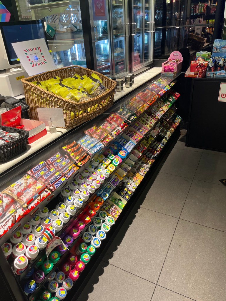
- Upon entering 7-Eleven, I first noticed the stores used black paint for the walls and had a more premium design aesthetic. 7-Eleven stores in America use white paint for the walls and don’t have an upscale feel.
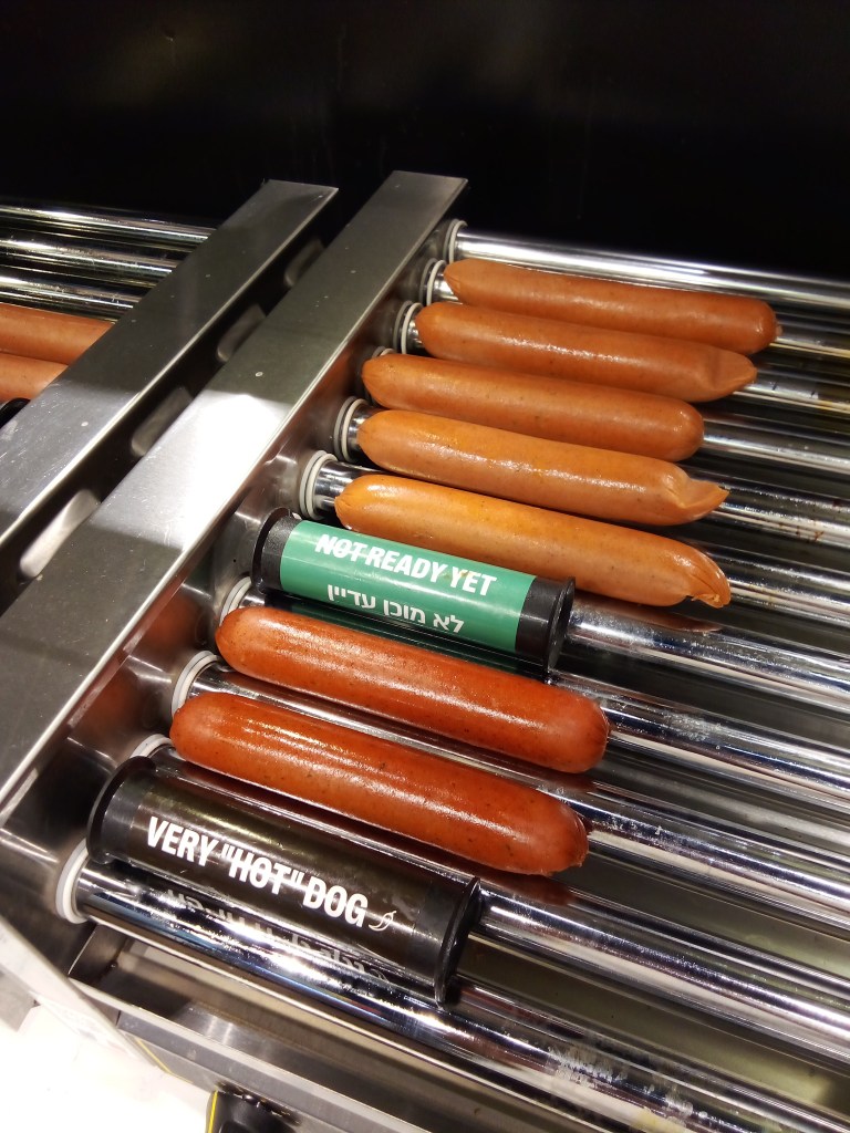
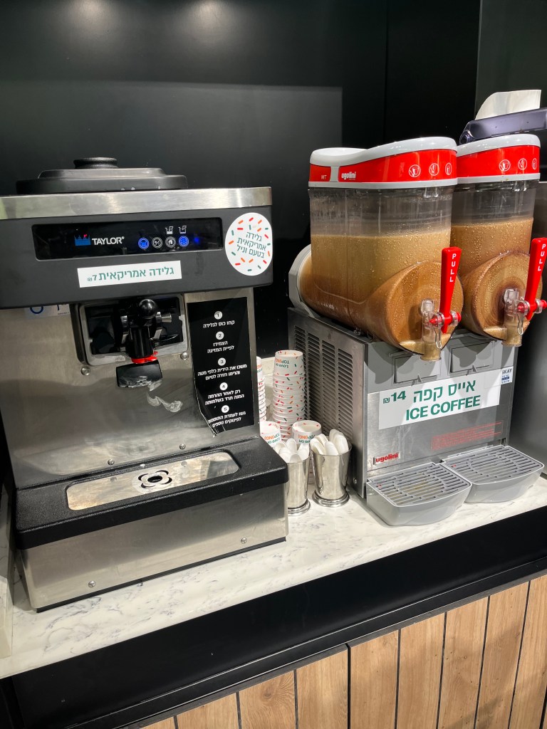
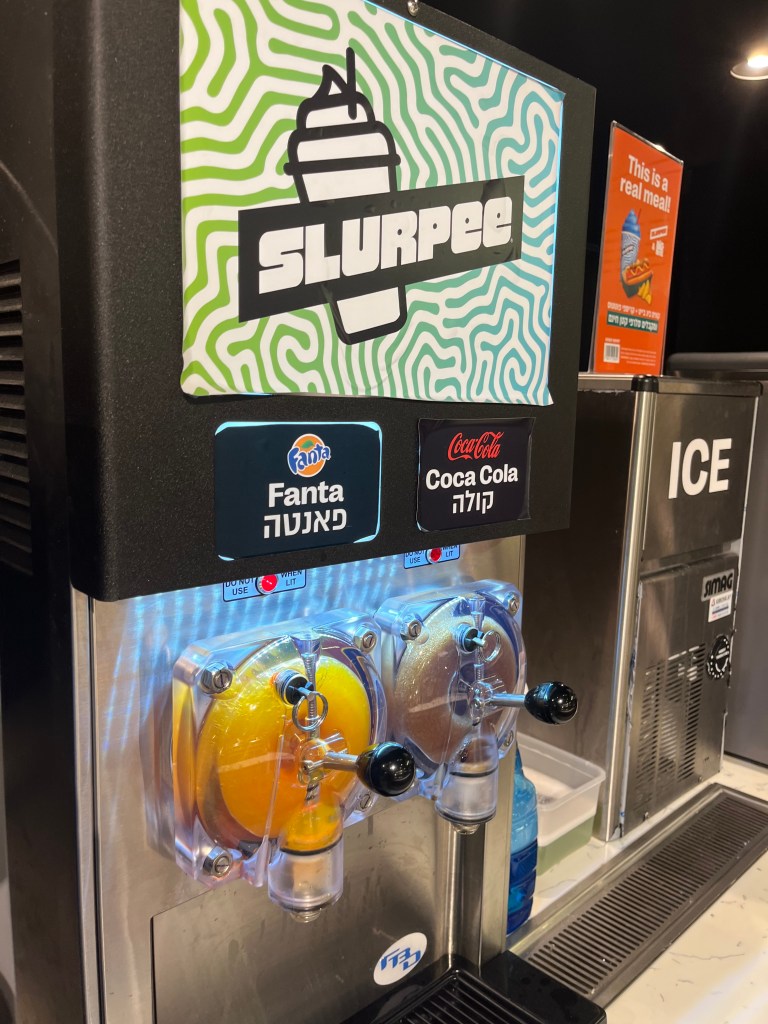
- I noticed the stores in Israel have continued the self-serve concept with customers able to grab their own hot dogs, pizza, coffee and soft serve ice cream alongside the traditional self-serve Slurpee and Big Gulp machines you can find in America.
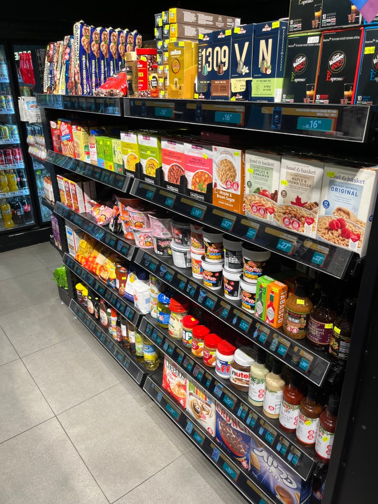
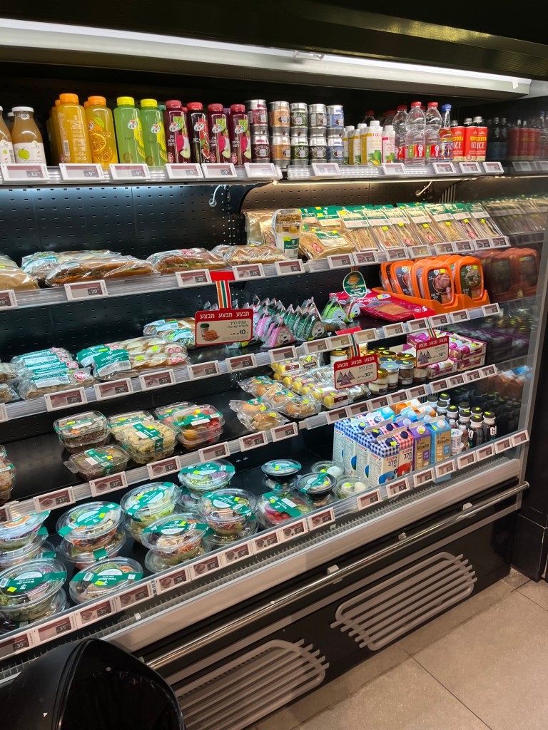
- I noticed Israeli products alongside imported products, which many international chains offer to cater to the local population.
- Another thing new to Israel was digital price tags, both color and black and grey, that display product names, prices and photos.
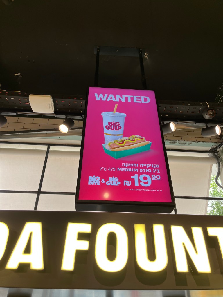
The last new thing I noticed was that a majority of labels and customer communications were in Hebrew. See below:
Living in Tel Aviv, I know there are many people who are new to Israel and don’t know how to read Hebrew.
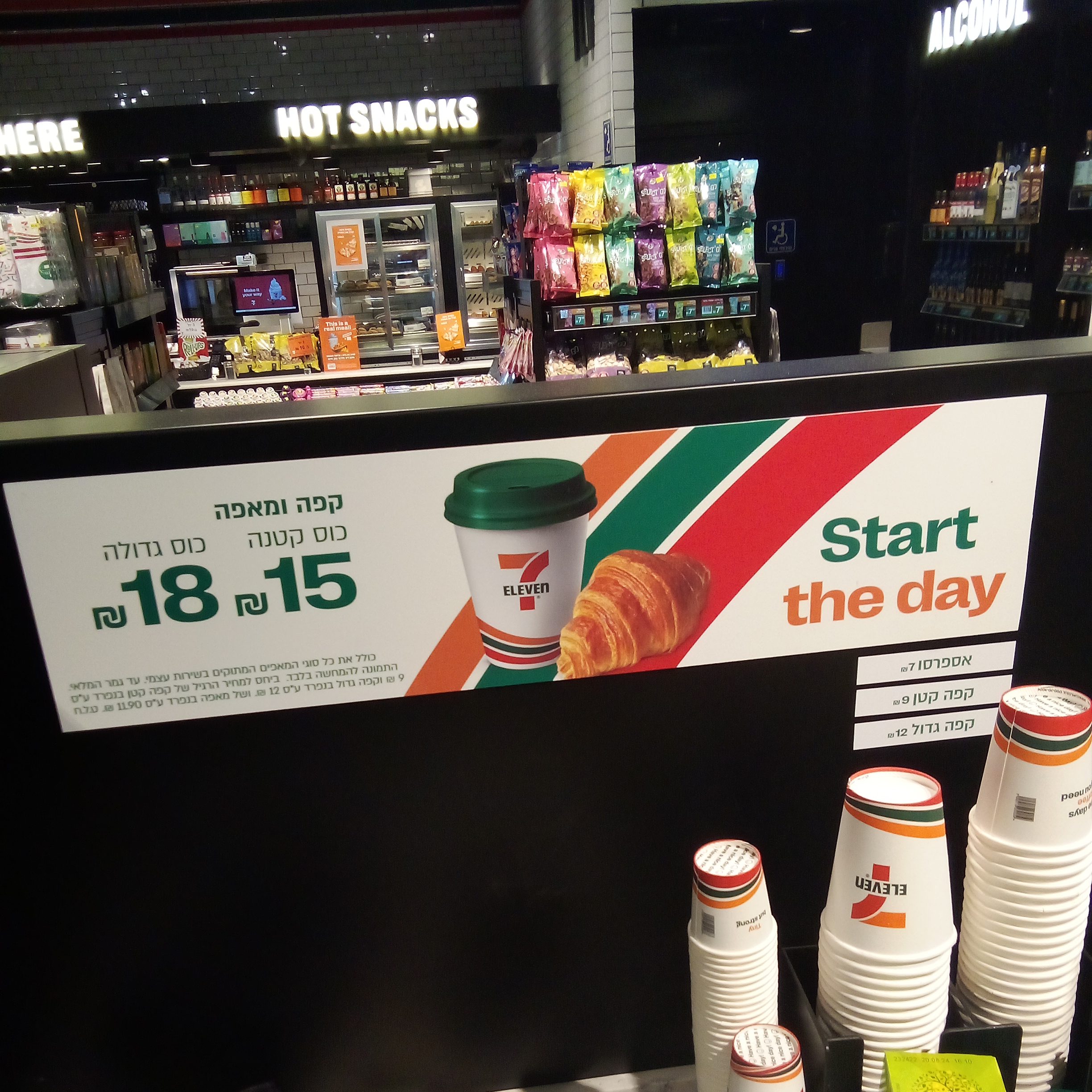
The Hebrew sign above says customers can receive a small coffee and pastry for 15 shekels, or a large coffee and pastry for 18 shekels.
Some attentive non-Hebrew speaking customers will be able to understand what the sign is saying by looking at the photo, but many get no value from the sign and will have to ask an employee or use their phone to translate it if they want to understand it.
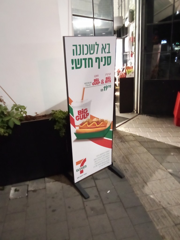
Photos of 7-Eleven Israel
Design Challenge
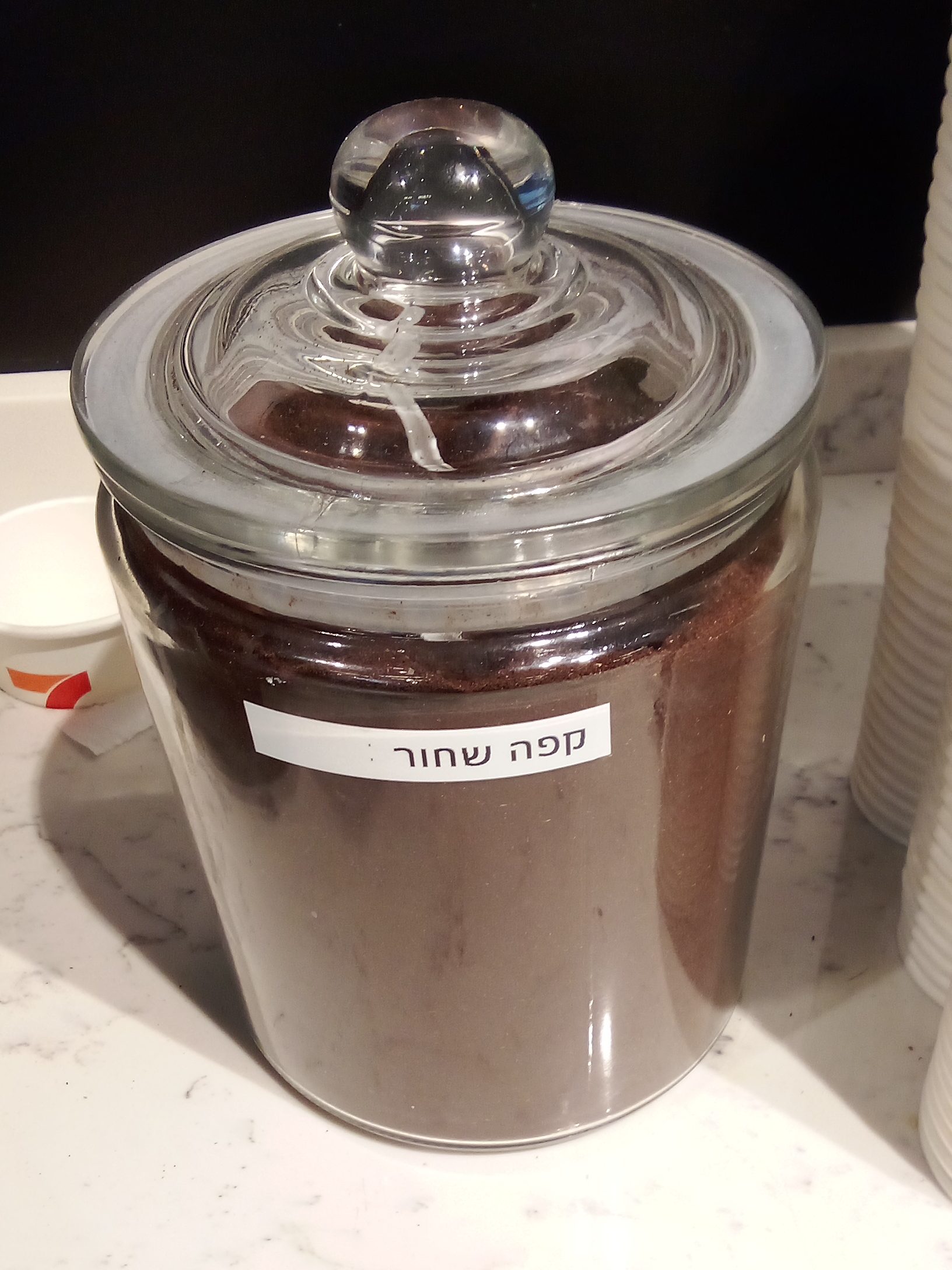
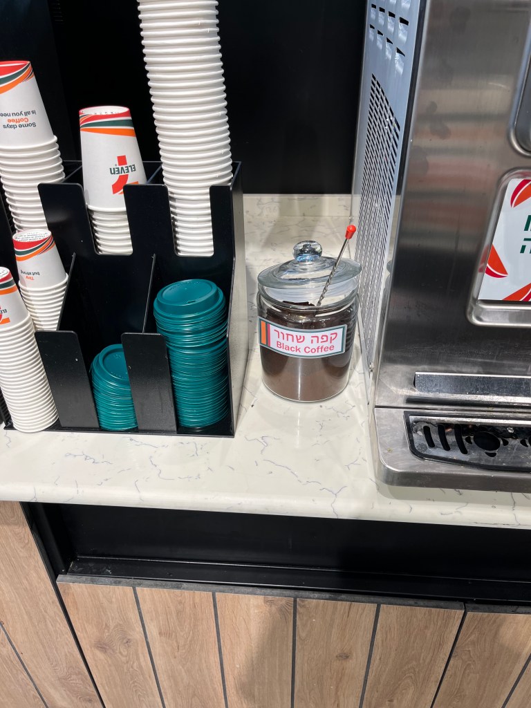
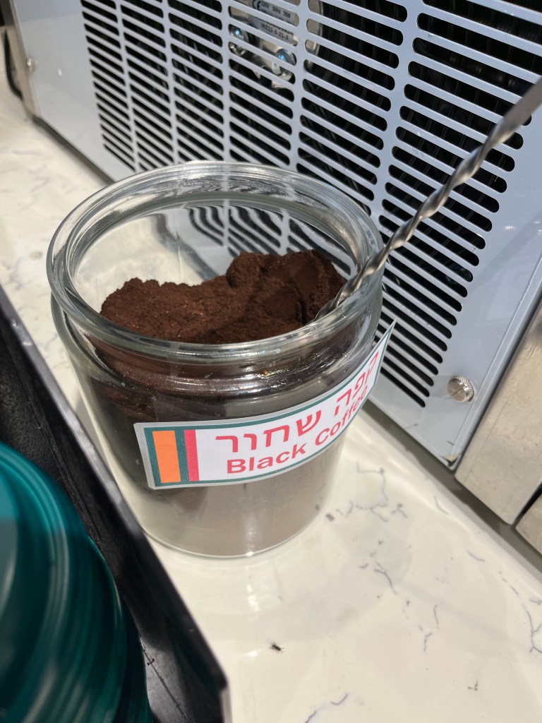
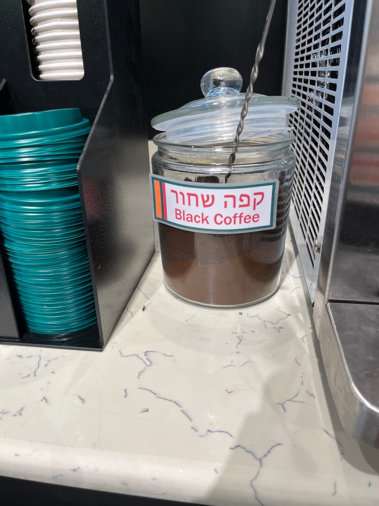
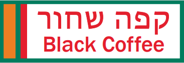
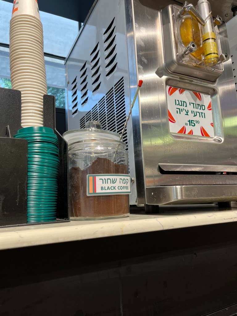
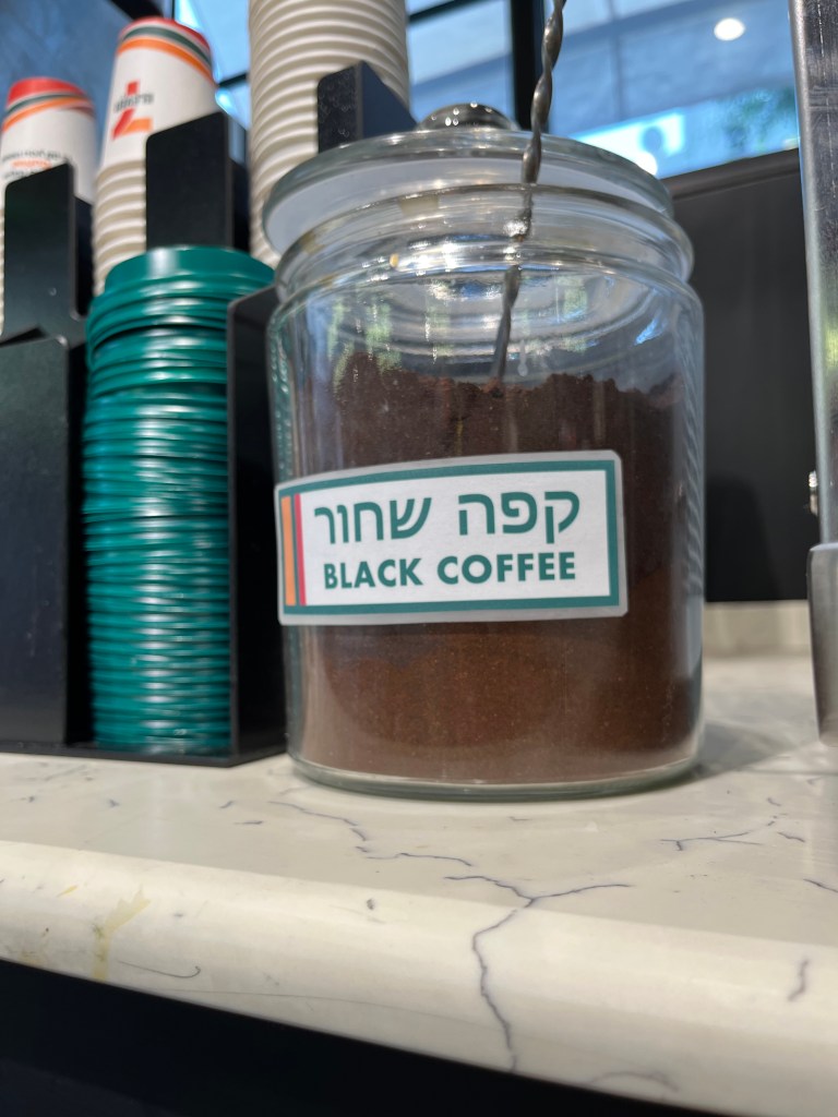
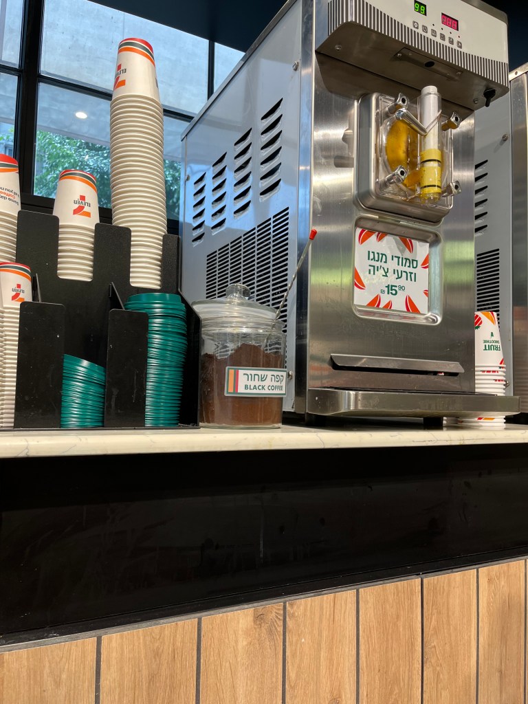
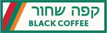
One product label that stuck out to me was the black coffee container label below. A Hebrew speaker would know “קפה שחור” means black coffee in English, but a non-Hebrew speaker wouldn’t understand this.
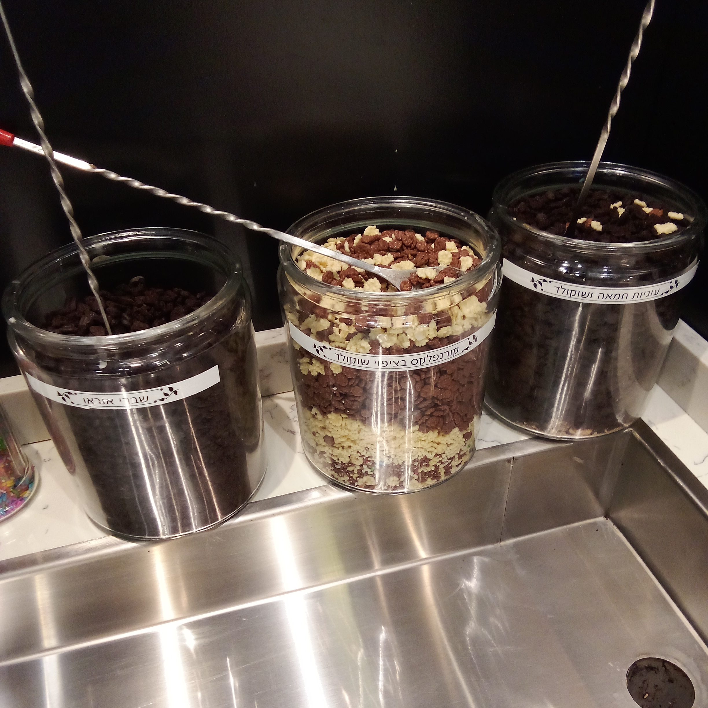
7-Eleven uses the same label for soft serve ice cream toppings:
I decided to design a bilingual product sign for the black coffee holder for the 7-Eleven close to me.
1st Design
I took the colors from the 7-Eleven brand and tried to design a label that would fit seamlessly with the existing signage.
See below for the 1st design iteration:

And photos of the sign at location:
1st Design Feedback
Feedback from employees
I went back to the store and asked a few employees what they thought of the first design. They gave me feedback including:
- English font isn’t aligned with the 7-Eleven brand
- The design of the sign looks like a cigarette
- See how balancing the 3 vertical stripes on both sides looks
- Add a playful coffee bean graphic
Feedback from myself
When I installed the sign at location, I noticed right away that the sign was too big.
When I got back to my computer and looked at the photos of the installed sign, I noticed the font color didn’t match the other signs in the store which have a green font.
2nd Design
I made changes from the feedback on the first design, including:
- Reducing the size of the sign
- Changed font color from red to green
- Changed font style of both languages
See below for the 2nd iteration:
And photos of the sign at location:
3rd Design
The 2nd design received approval from employees but I wanted to push my design skills further. I made the following changes to the 2nd iteration:
- Rearranged the colors of 3 vertical stripes, and slanted them
- Staggered the vertical alignment of the Hebrew and English fonts
- Added a cream background
Next Step
The next step will be to show the sign to the manager of the 7-Eleven. I asked for his approval to install the sign for photos, so he’s aware that I design marketing material.
I hope when I tell him this sign was improved based on feedback from his employees, he will be more interested in the sign and working with me.
Thanks for viewing my case study!
If you’d like help marketing your local business, contact me to get started.
